7 Essential Elements of An Ecommerce Landing Page
While your home page is the ideal place to generate traffic and leads, landing pages are an essential source for ecommerce conversions.
The question is: how do you design one that effectively creates these conversions? And which design elements can actually work against driving sales?
These essential elements can help you get the most out of your ecommerce landing pages:
#1: Have a Clear Call-to-Action
Having a clear and obvious call-to-action (CTA) is one of the most important (if not the most important) elements to include on a landing page. On an ecommerce website, the CTA acts as a guide that tells visitors what they should do next.
Technically, a CTA can be a plain-text link but it will likely be more effective as a button that was purposely designed to stand out against the rest of the page. In fact, according to CreateDebate, making CTAs look like buttons improved clicks by 45%.
When it comes to designing CTAs for ecommerce landing pages, make sure to optimize for the following four elements:
- Design
- Message
- Placement
- Testing
A test for Performable’s website found that red CTAs increased their conversion rate by 21%. Conversely, SAP found that orange CTAs boosted their conversion rate to 32.5%.
The takeaway? An effective color for your CTA button will depend on your brand, audience, and many other factors.
According to Marketing Experiments, 52% of business and marketing agencies that use landing pages conduct tests to improve conversions.
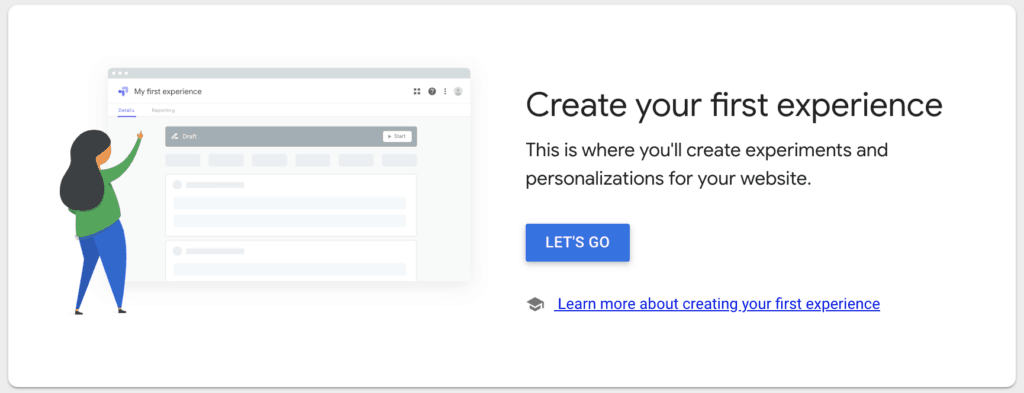
To determine the right mix of colors and text, as well as some of the other elements listed above, you’ll have to do some A/B testing. Google Optimize can help you test different ecommerce landing page variations for free.
#2: Write a Killer Headline
The headline is the first thing that a consumer will see on your landing page. It can be a deciding factor for if a visitor will stick around to consider your entire ecommerce landing page — or if they’ll just leave.
A killer headline is something that easily gets the attention, interest, and understanding of the visitor — enough to make them stay and learn more. According to Unbounce, more than 90% of visitors who read the headline also read the CTA copy.
If you’re not a wordsmith by trade, use these basic tips for making effective landing page headlines:
- Be short and direct to the point.
- Don’t make headlines confusing — get specific with the information you provide.
- Don’t be misleading. Whatever content you include under your headline should fulfill the expectations set by your headline.
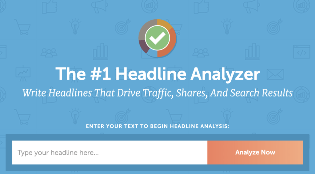
CoSchedule’s free Headline Analyzer tool can help you test out your ideas.
#3: Explain your Unique Selling Proposition (USP)
A unique selling proposition (USP) involves the factors that make your product or service distinct from your competitors.
Your USP might encompass one or many of the following:
- Selling at a lower price
- Offering higher value or quality
- Providing a very specific service that others don’t
- Using materials or ingredients that others don’t
Differentiate yourself from others by clearly defining why your customers should buy your product or service over the competition.
To do this on your ecommerce landing page, provide simple yet attention-grabbing (and easy to understand) information. This can take the form of written copy (bullet points are your friend) or visuals like images or videos.
#4: Display Social Proof
According to research conducted by Hubspot, 71% of millennials are more likely to purchase a product based on social media referrals.
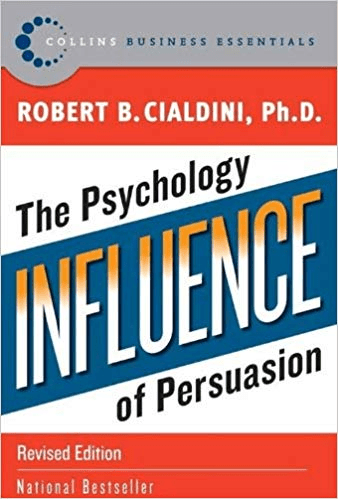
Social proof is a concept named by bestselling author and psychologist Dr. Robert Cialdini in his book, Influence.
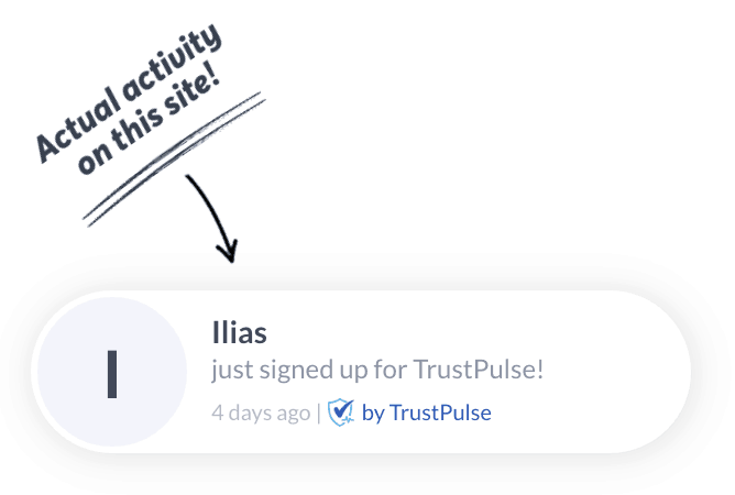
Social proof refers to the influence that other people’s actions have on our own. By demonstrating that other people are purchasing from your website using social proof (such as customer reviews), you reduce the friction for a first time customer to make the decision to buy from you.
Social proof is an important element for ecommerce in general — especially ecommerce landing pages.
A great example is Basecamp’s homepage. They leverage the persuasive powers of social proof by showing how many businesses have signed up to use their platform in the past week.
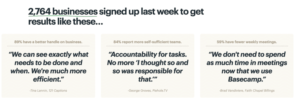
You can make use of social proof on your ecommerce landing pages by sharing metrics around the volume of sales over a certain time period, sharing social media reviews, and showcasing user-generated photo content. Essentially, show prospective customers that other people are enjoying your products and services, and they will too.
TrustPulse is a new solution from the team behind OptinMonster that can help you automate your social proof promotions with real-time updates.
#5: Eliminate Site Navigation
Landing pages often act as standalone pages from your main website. As such, your landing page shouldn’t display the same top level navigation as the rest of your website.
Adding the site’s navigation bar and other click-through opportunities will distract from your main CTA. You don’t want to split attention from your most important conversion action and the links in your regular top-level navigation can actually work against you in this situation.
To summarize, make sure that your ecommerce landing page focuses on just one goal and one CTA.
#6: Ensure a Great User Experience with Mobile Responsiveness
With mobile usage quickly overtaking desktop internet use, a failure to optimize your ecommerce landing page for mobile responsiveness can be a huge conversion killer.
Not convinced? Consider these important mobile statistics:
- According to BrightEdge, ~51% of customers say that they use mobile devices to discover new products and brands.
- According to Google, 89% of consumers are also more likely to recommend a brand after having a positive mobile experience.
- Also according to Google, 46% of people say that they will not purchase again from a brand that gave them an interruptive mobile experience.
Furthermore, according to Adobe, only about 50% of all landing pages are mobile-optimized.
Don’t be a statistic: avoid missing out on conversions by ensuring that your ecommerce landing pages are responsive to any device or browser.
#7: Include Attention-Grabbing Visuals
Your landing page should not only grab people’s attention through text but also through visuals.
According to a study by 3M, human brains can process images 60,000 times faster than text. The same study also found that presenters who use visual aids are 43% more effective in getting people to do what they want.
In general, humans can respond to and process visual information much better than other types of data. With all this in mind, it’s important to strategize around the visuals you include on your ecommerce landing page.
Consider using the following:
- Clean and compelling product images.
- Videos or animations to show your product in use. Dropbox was able to increase their conversion by 33% when they added a video on their homepage.
- Visual elements that match your brand, including your logo, brand typography, and colors associated with your brand.
- User-generated content: text reviews, tagged photos, and videos.
Whatever visuals you choose, just make sure they’re relevant. Using the wrong/misleading visuals can be a conversion killer.
Final Thoughts: 7 Essential Elements of An Ecommerce Landing Page
Creating a high-converting ecommerce landing page is no easy task. But armed with these tips, you’ll have the best chance of success.
Don’t forget that the Quick Checkout WordPress plugin can also reduce friction with a smooth checkout flow that’s ideal for ecommerce landing pages. Using this plugin enables visitors to directly complete checkout without navigating away from the current page they’re on. Which other elements do you consider essential for your own ecommerce landing pages? Tweet your thoughts at @quickcheckout!
